Amana. Branding

In Support of Bahrain’s Development
Creating a New Brand for Amana
The Amana brand (Amana meaning ‘support’ in Arabic) has been developed for a property and facilities management firm based in Bahrain. As part of a company wide brand review and development exercise by Edamah (Amana’s parent company), Unisono was tasked with developing a new entity capable of ensuring the down stream properties and the existing portfolio were properly and professionally managed.
With an aim to become the foremost authority of real estate and property management in the Kingdom, it was essential that the Amana brand projected an image of professionalism and trustworthiness to help it achieve it’s vision for the Kingdom, and live up to the weight of it’s own given name.
Introducing the Amana brand
Originally named Edamah Property Management Company (EPMC), the Amana brand was initially established as a part of the SWF’s real estate arm’s (Edamah) operations. Following the appointment of Amin Al Arrayed as CEO, a new vision was carved out for the entity, with greater oversight and independence than ever before.
Challenges encountered in the Amana brand
Even with the full support of Mumtalakaat, EPMC lacked a distinct identity and brand position to allow it to compete with the internationally known property management & real estate service providers present in the Kingdom. The organisation is a dynamic and innovating real estate services provider, overseeing the maintenance and financial viability of some of the government’s largest properties and projects, including the extensive Saa’da waterfront project of Muharraq. It exists to provide a reliable real estate backbone that supports and enhances the experiences of businesses and Bahrainis in the Kingdom.
As part of the rebrand we conducted a highly collaborative strategy workshop with the leadership team to uncover the core purpose and motivation behind EPMC. This alongside the insights gained from the Edamah Why™ Workshop, painted a picture of the issues that faced the brand. What was needed was a solution that would create a public perception of a government owned provider with utmost trustworthiness, providing international standard services.
In addition, EPMC unanimously agreed that a name change would be essential to helping the organisation develop an identity of its own, and position them as a leading R.E services provider in the nation. Our role was to create the right identity elements that capture the brand’s collaborative and innovative essence, and make those traits part of the brand’s public perception.
Our strategic response
The Amana brand project began with developing a new strategy to pull EPMC out of the shadows of Edamah’s legacy and help realise its own distinct brand vision. We knew the brand had to invoke a stature of responsibility, so that it could establish itself as a trusted partner for property success that could delivers on its promises to its tenants, customers and the government of Bahrain.
Through the Amana brand strategy, we discovered the EPMC’s ‘Why’ – also known as the brand’s purpose or reason for being: To find a better way and share it. This provided the foundation for its vision, “To facilitate enhanced experiences” which needed to be supported by a new brand promise “to help people and places perform better”. With the brand’s reasons for existing realized, we were able to discover the core values that defined the essence of the brand: dynamism, collaboration and responsibility. These refined values expressed the brand’s persona, as a force of creativity, devotion, and discipline and culminated with the brand’s new positioning (empowering property performance) within the market.
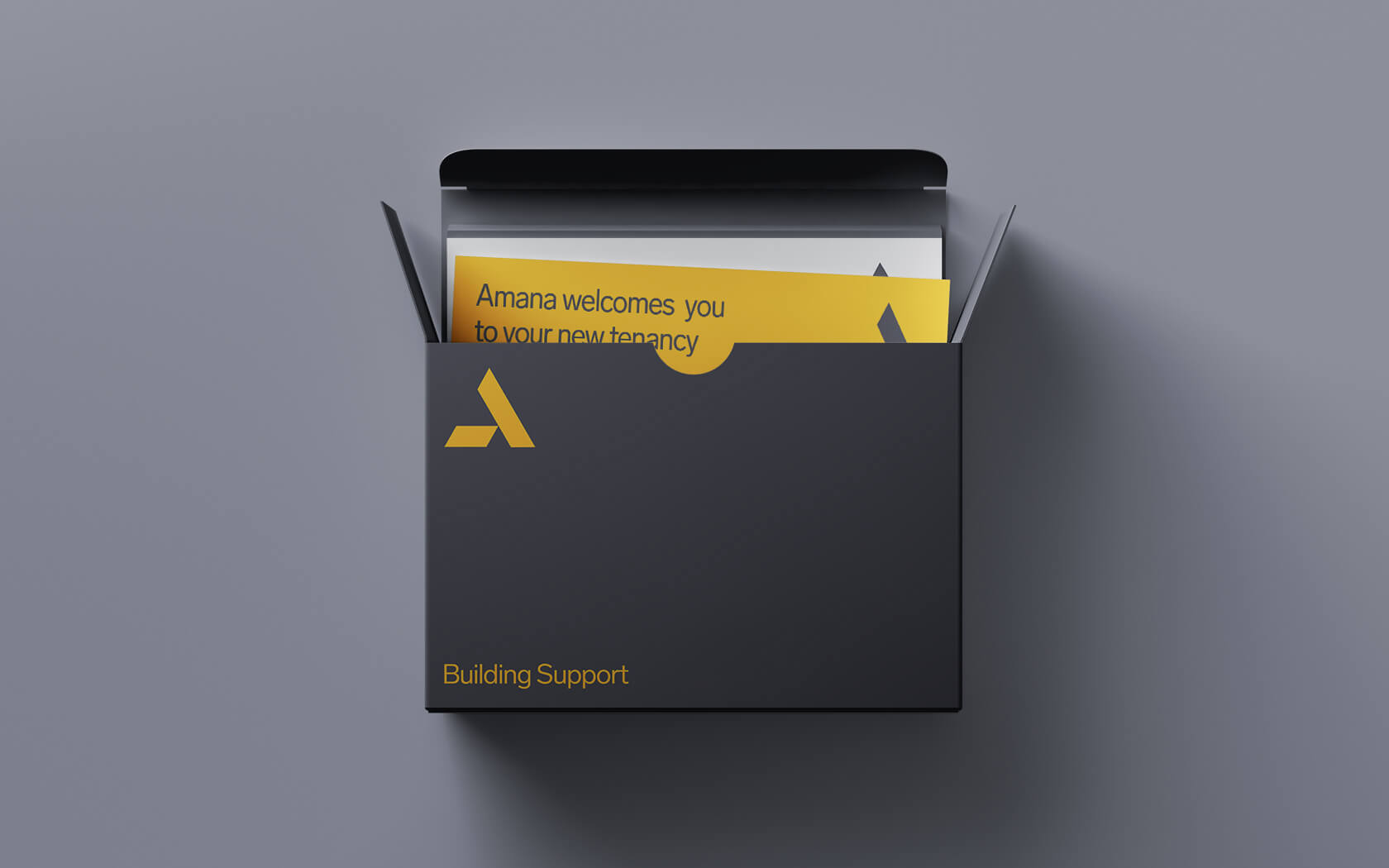
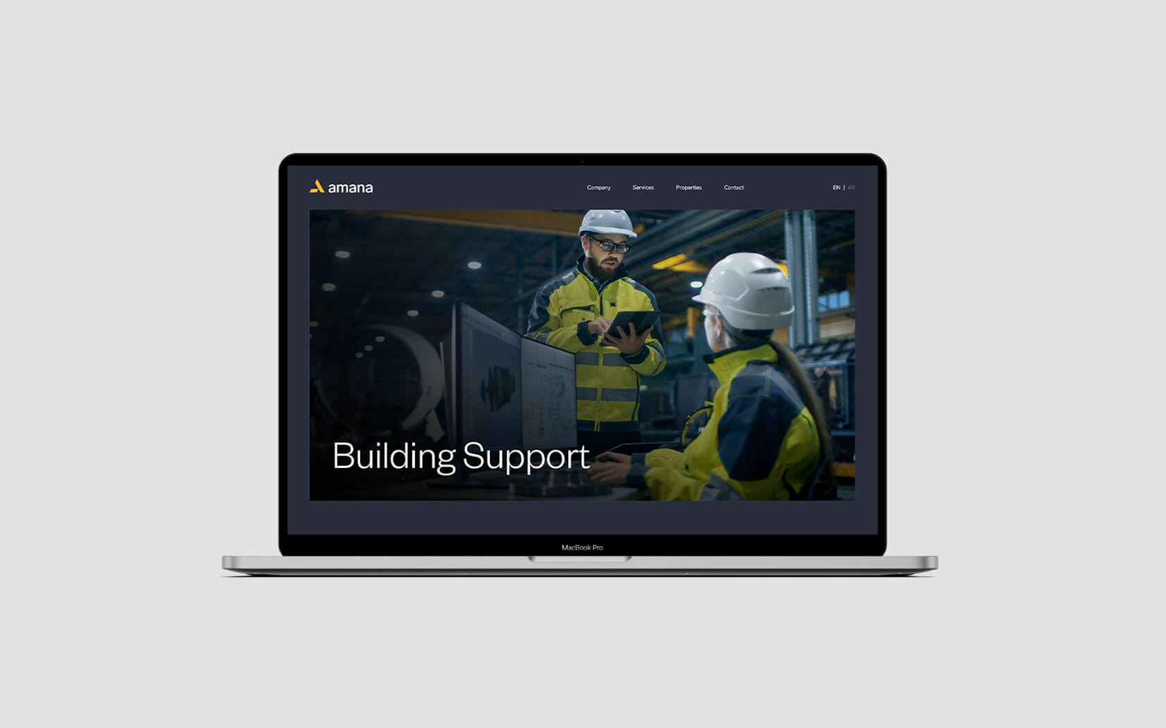
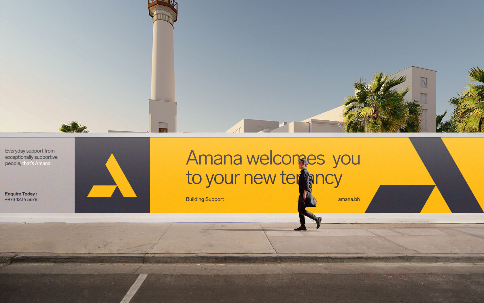
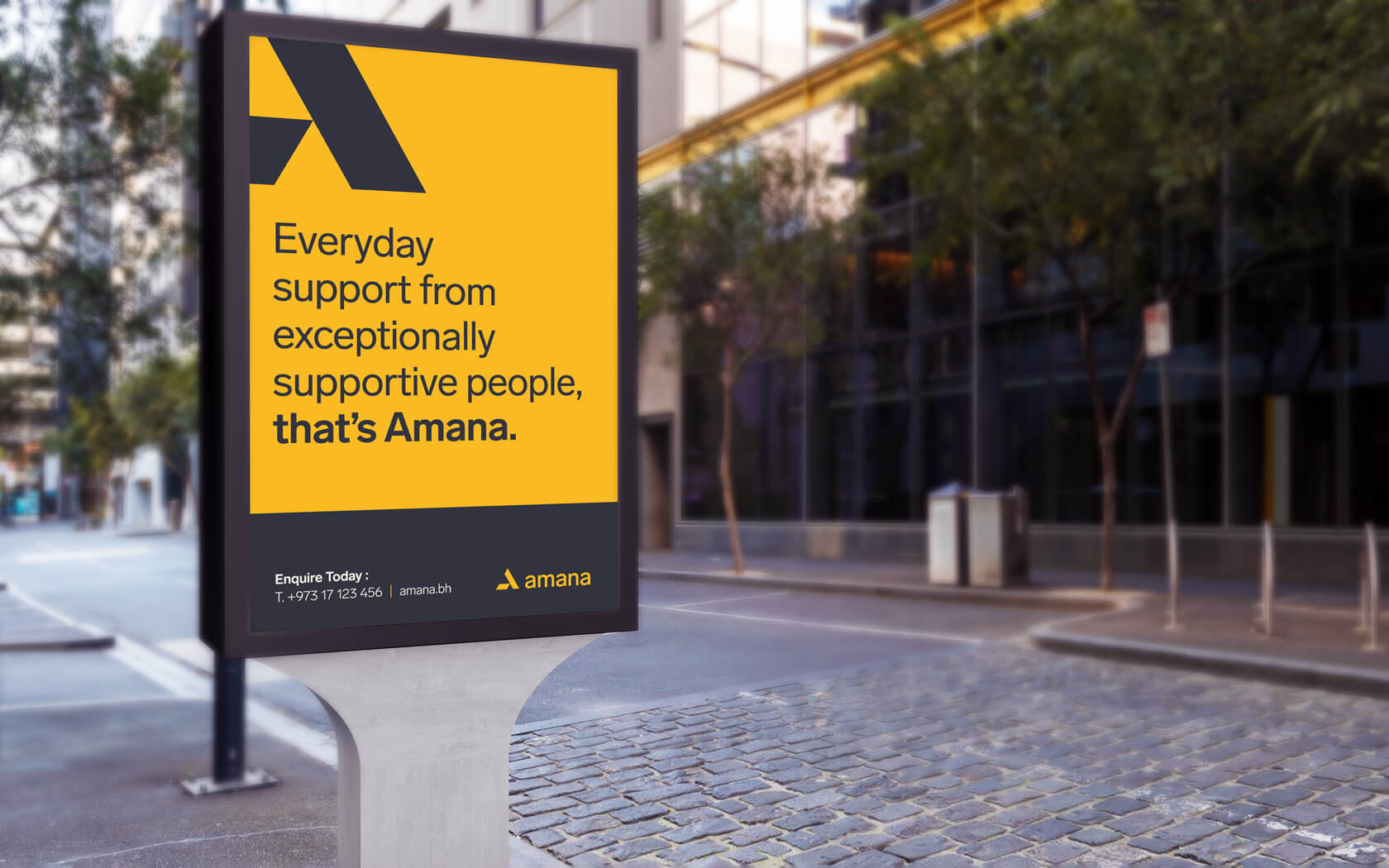
With the fundamentals of the Amana brand realized, we worked on discovering a new brand name that upheld the brand’s intention of being a trusted partner in property, whilst also maintain a link to local culture. After extensive research and discussions, ‘Amana’ was chosen for the name to represent the brand’s desire to be an authentic & reliable partner in property. Finally the brand’s slogan ‘Building support’ was developed to echo Amana’s mission across all it’s future communications.
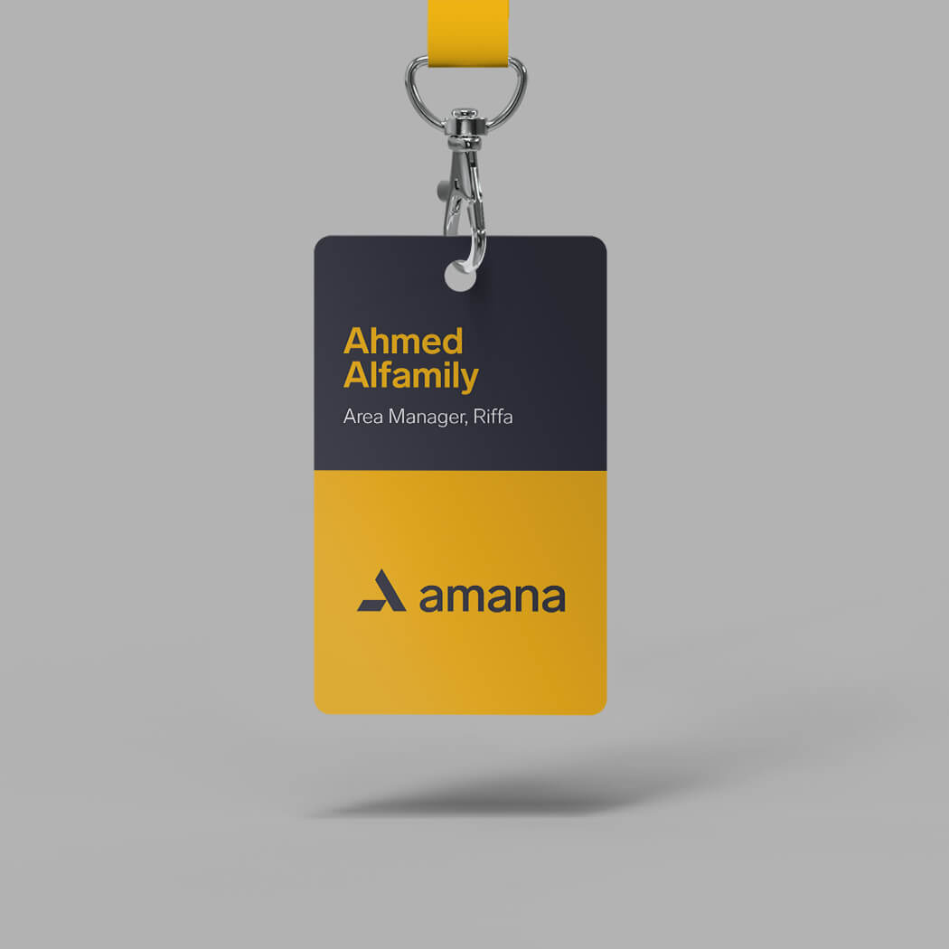
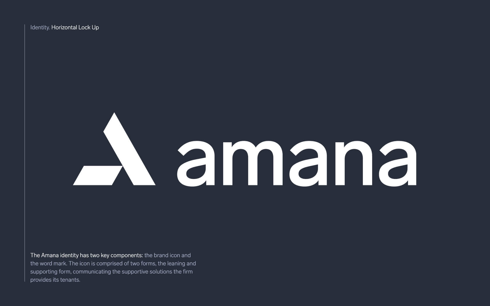
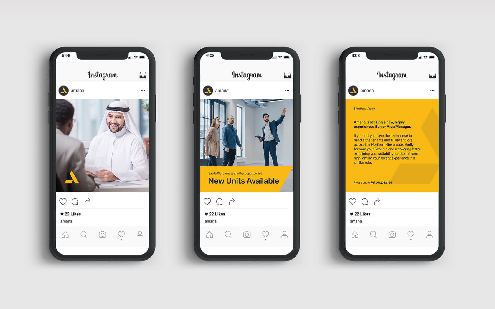
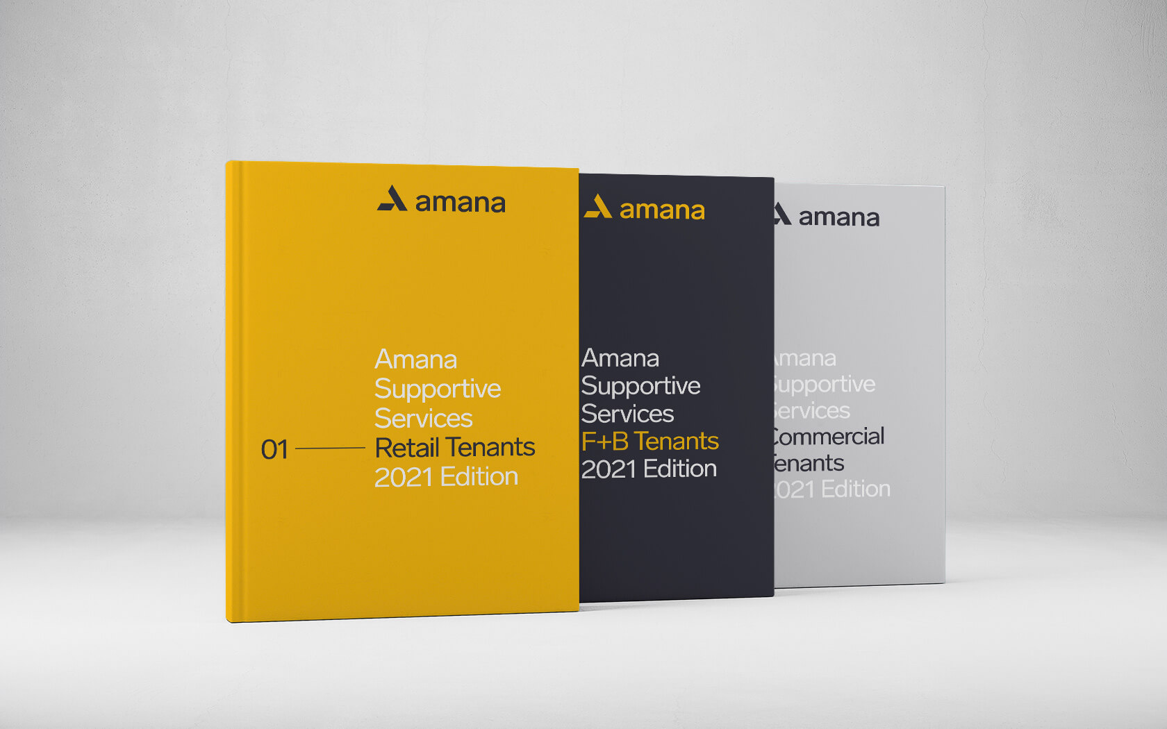
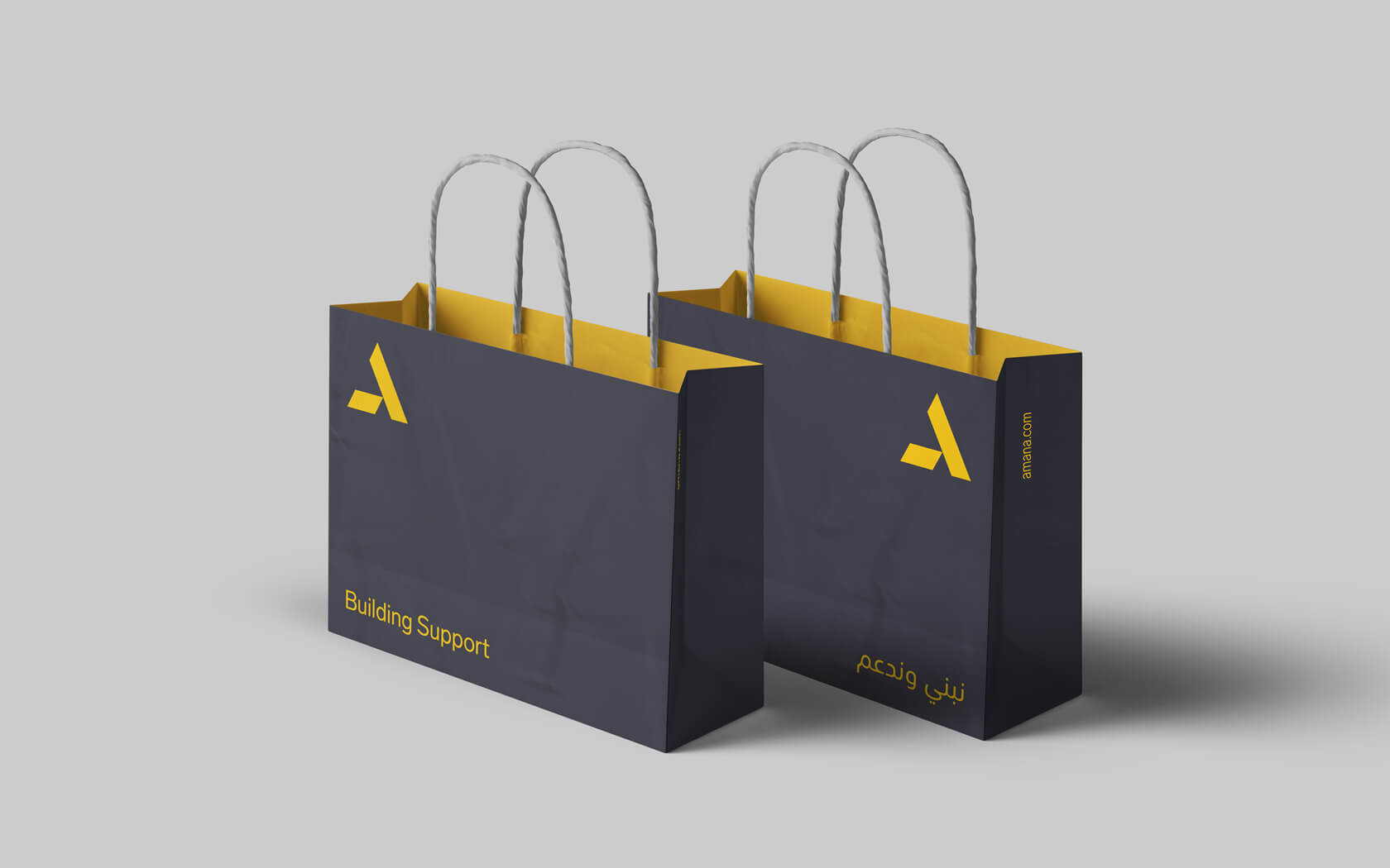
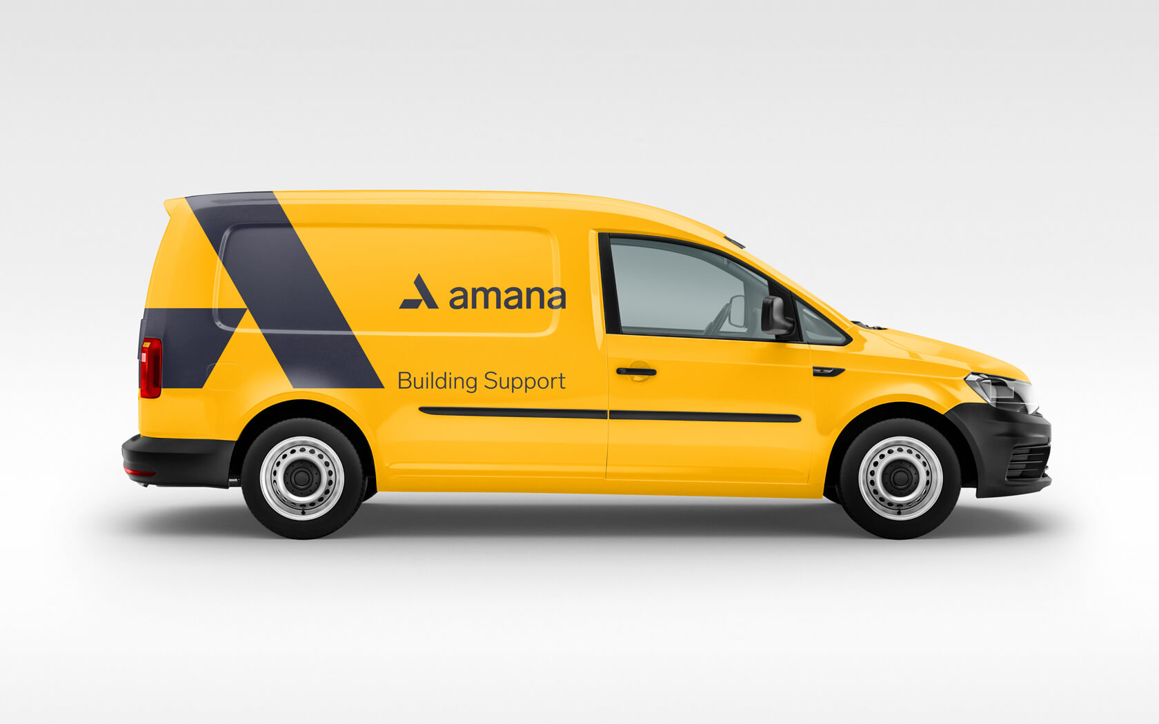
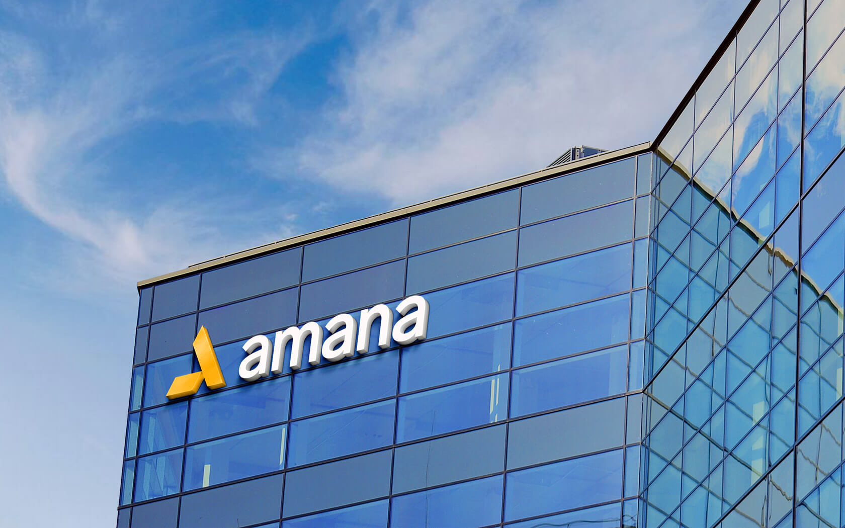
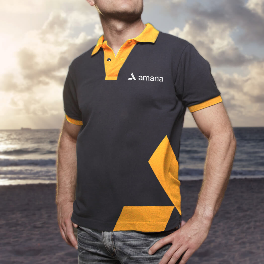
Under the new name and slogan, a new Amana brand identity was developed, consisting of an invented logomark & tailored typographic treatment and accompanied by a vibrant colour palette.
Results of the Amana brand development project
With a fully aligned strategy & newfound brand identity, the Amana brand is now perfectly positioned to cement itself as the authority in real estate within the Kingdom and as a world-class provider of property services to its residents and businesses.
We received stellar feedback from the firm’s leadership team and board of directors, and the perception of a vessel of supportive and trustworthy property management has been widely noted. To see the Amana website, click here
Services delivered
Brand Design, Visual Identity, Slogan, Tone of Voice, Packaging, Apparel, Merchandising, Advertising, Graphic Design and Web.
Thank you. We are getting a lot of supportive comments for Amana’s strategic new brand identity
Waleed Ali. CEO. Amana
Details View Close


This was a very rewarding project from the get go. The brand feels very international and able to go head to head with its global contemporaries.
Liam Farrell. Creative Director & Partner.
Bank Muscat.
Rebrand
Bank Muscat's iconic rebrand is helping a regional leader to grow beyond traditional banking.
GFH.
Calendar
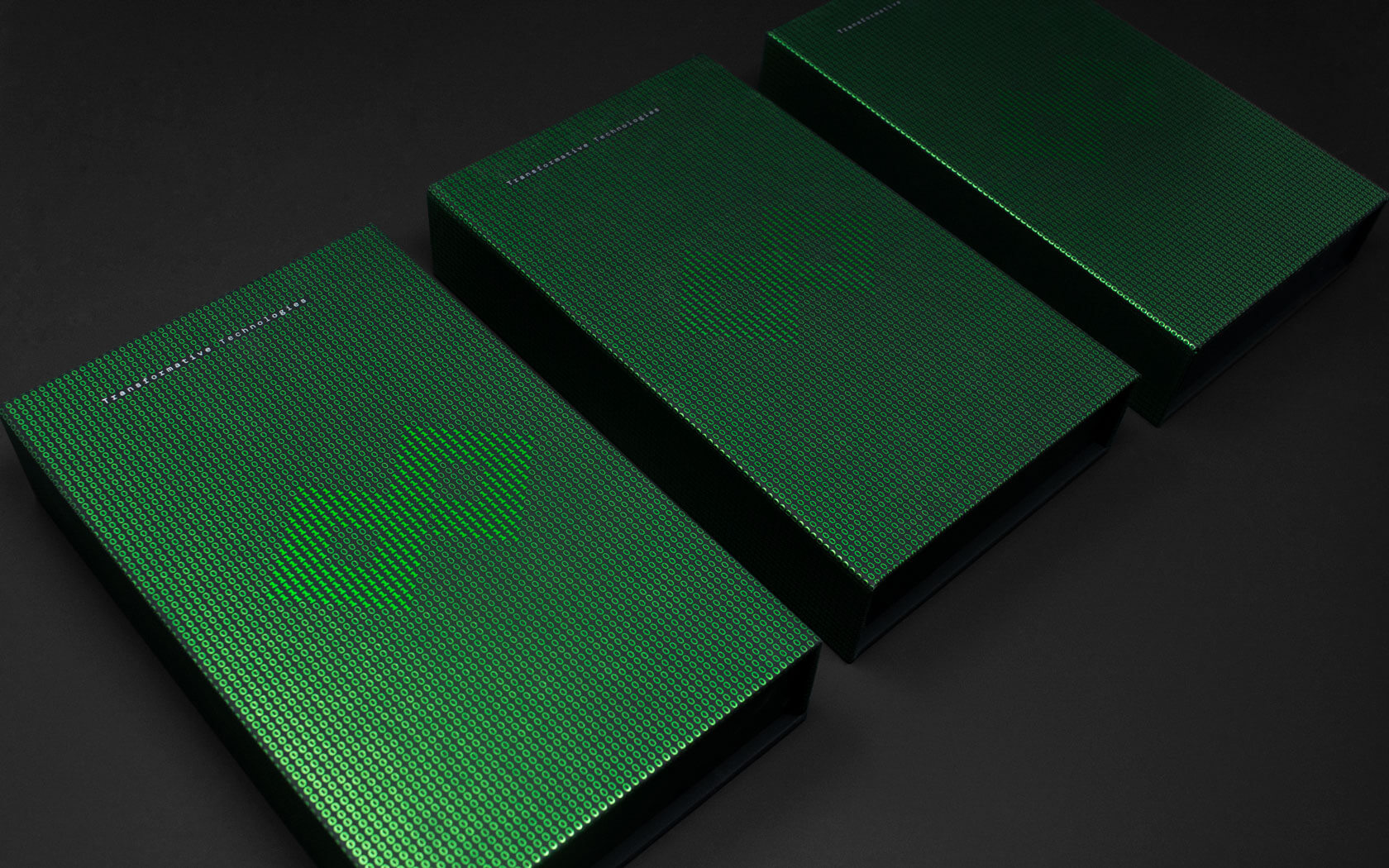
Slick foiled covers and tech-savvy design combine to great effect on this 2021 GFH calendar, created for a leading financial group in Bahrain.
Khaleeji
Rebrand
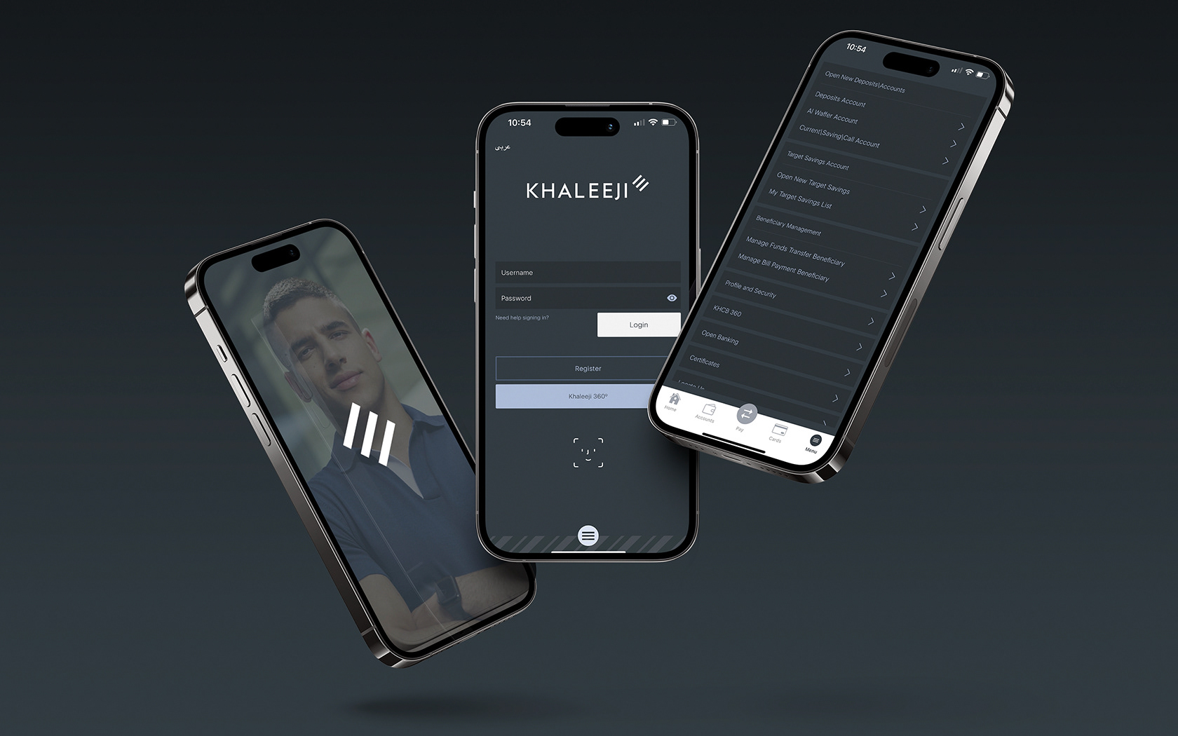
Khaleeji have a whole new digital brand experience which is helping the brand provide a pure digital offering to a newly refocused niche we call ‘the ambitious’.
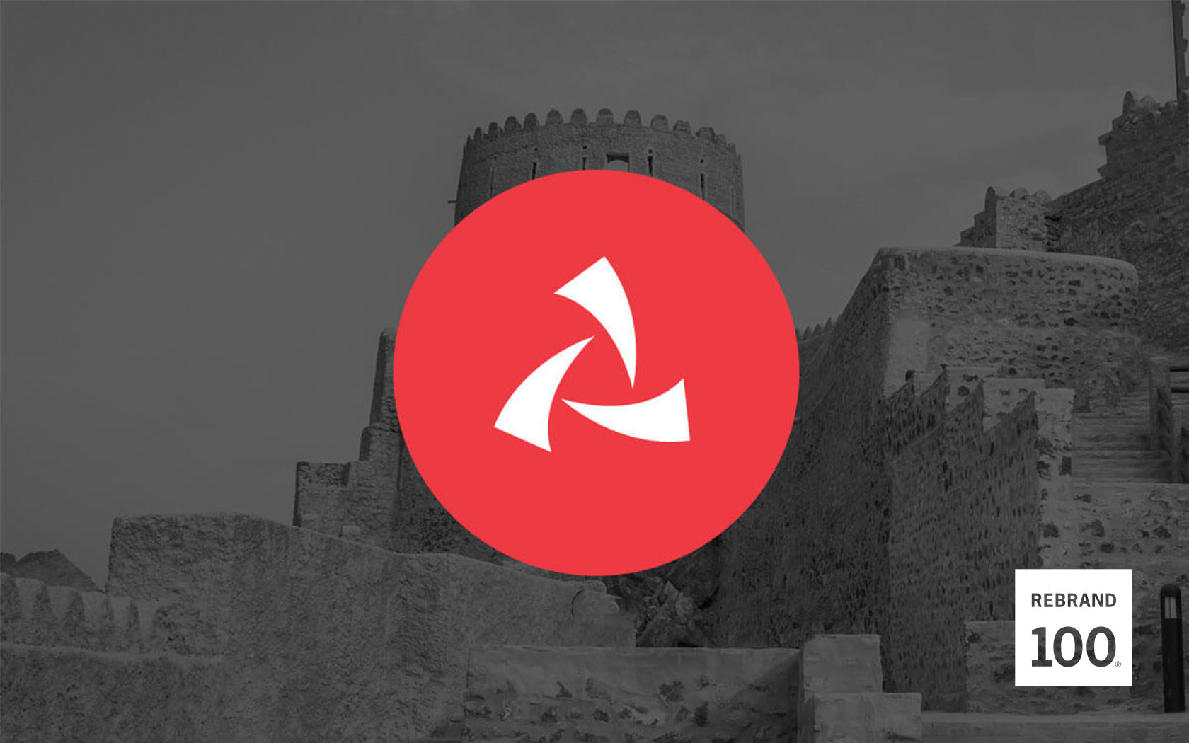
Al Nooh.
Rebrand
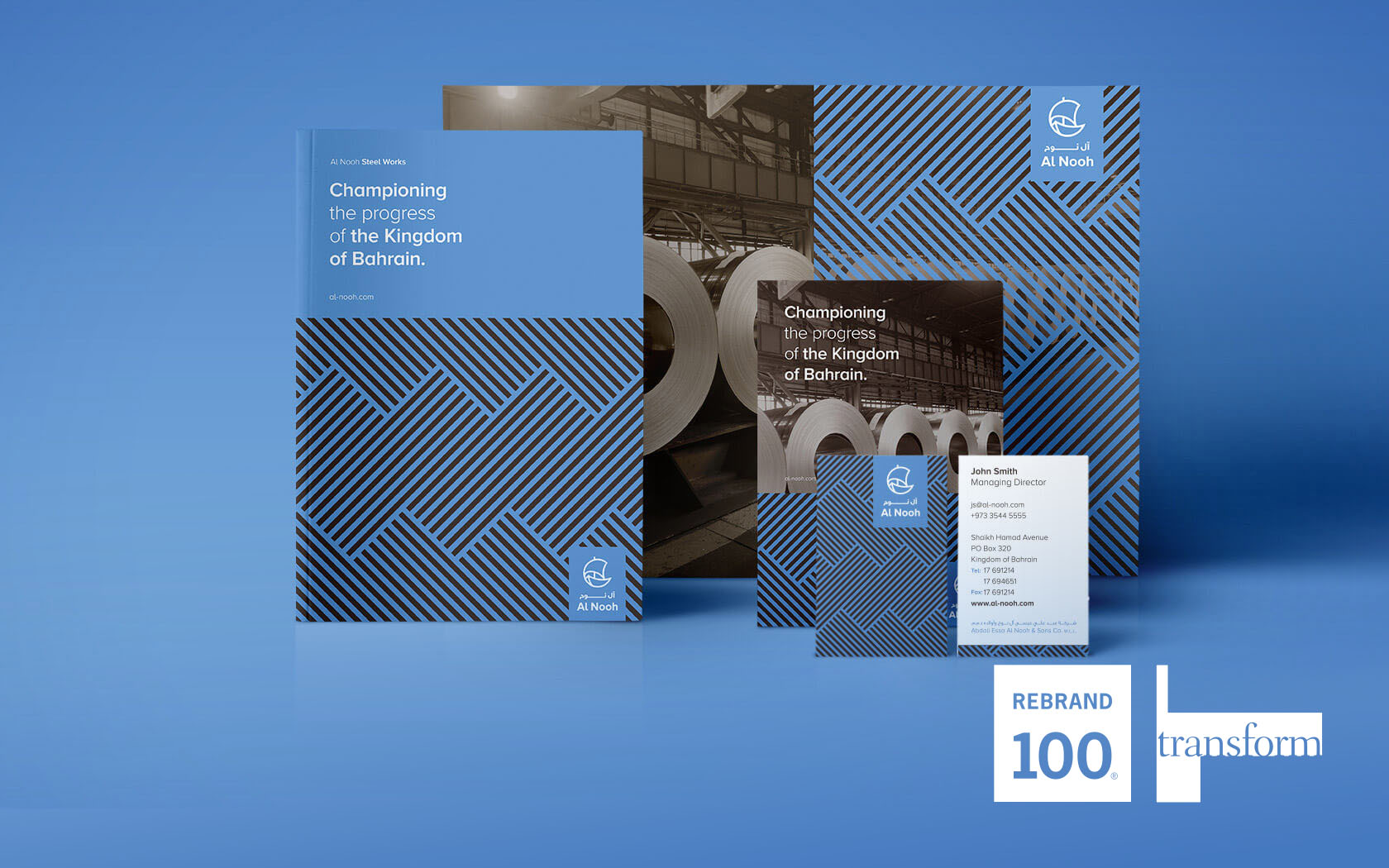
Winning Visual Identity of the Year by IVIA, Rebrand 100 in 2018 and Gold & Silver Transform Awards in 2017 says it all for Al Nooh.
Khaleeji
Brand Book
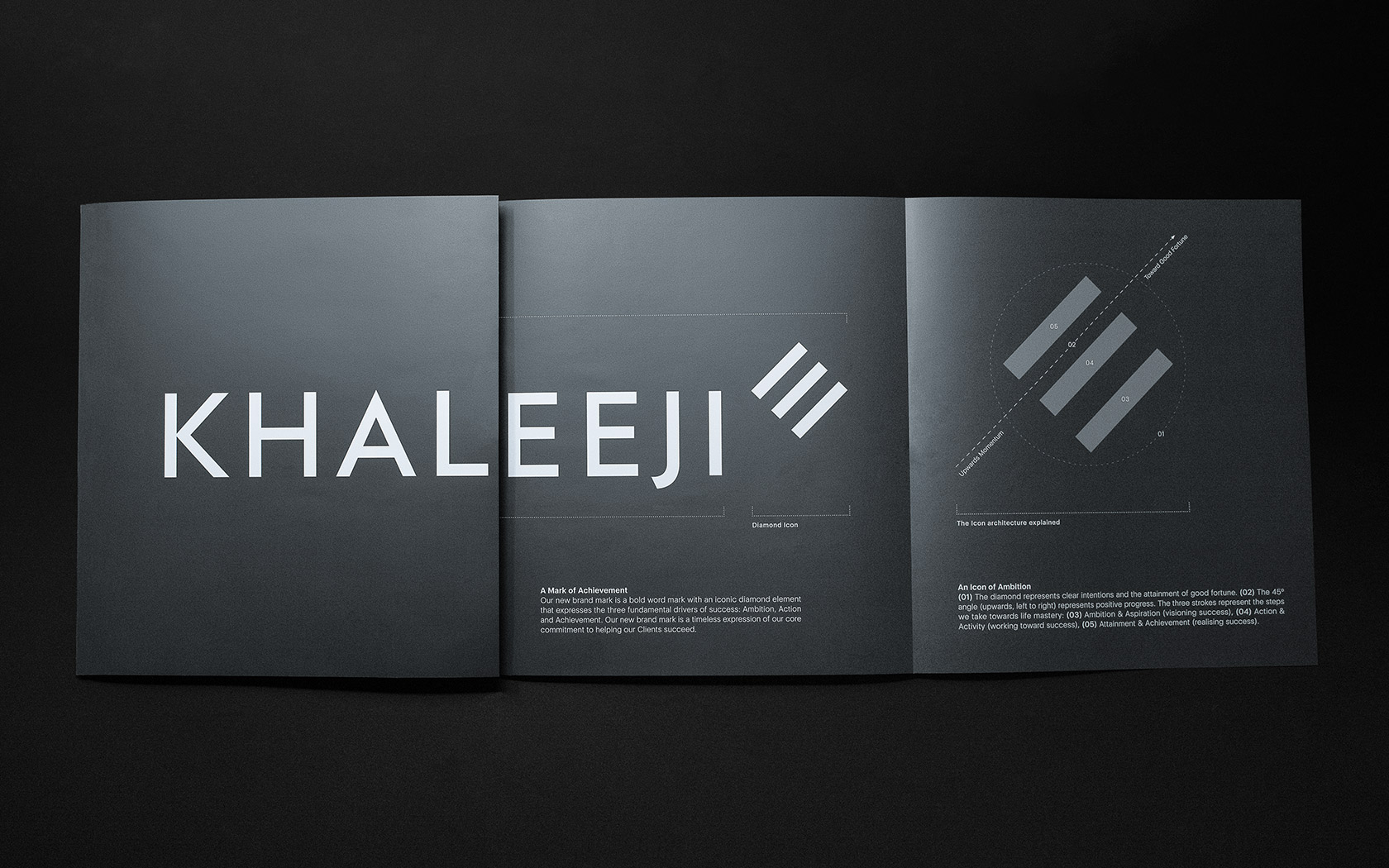
Helping cement understanding of its ambitious new brand is this rather fancy launch book for Khaleeji. Prestige papers and refined print treatments provide a touch of class from cover to cover.