Delilah's. Branding
A truly tasty new take away brand
An introduction to Delilah’s, the cafe brand
Delilah’s is a cafe in Bahrain and part of BMMI’s F&B division. The owners of the food brand had built the cafe brand into a multi-unit offer with locations in three venues across the island. The cafe brand is conveniently located next to BMMI’s Alosra (‘the Family’ in Arabic) supermarkets, providing quick and convenient cafe experiences for tired shoppers. The cafe is especially popular with parents and mothers with children.
Challenges of a cafe brand
The challenges Delilah’s is facing is how to position the brand for growth and what avenues to take to increase revenues. The brand was not strongly positioned in the market and its offer was not clearly communicated or aiding differentiation from other cafe brands. The cafe brand was suffering and the firm was looking for help in realising the best aspects of the offer and on what equity could it leverage for growth.
Strategic guidance helped Delilah’s discover its true brand brilliance
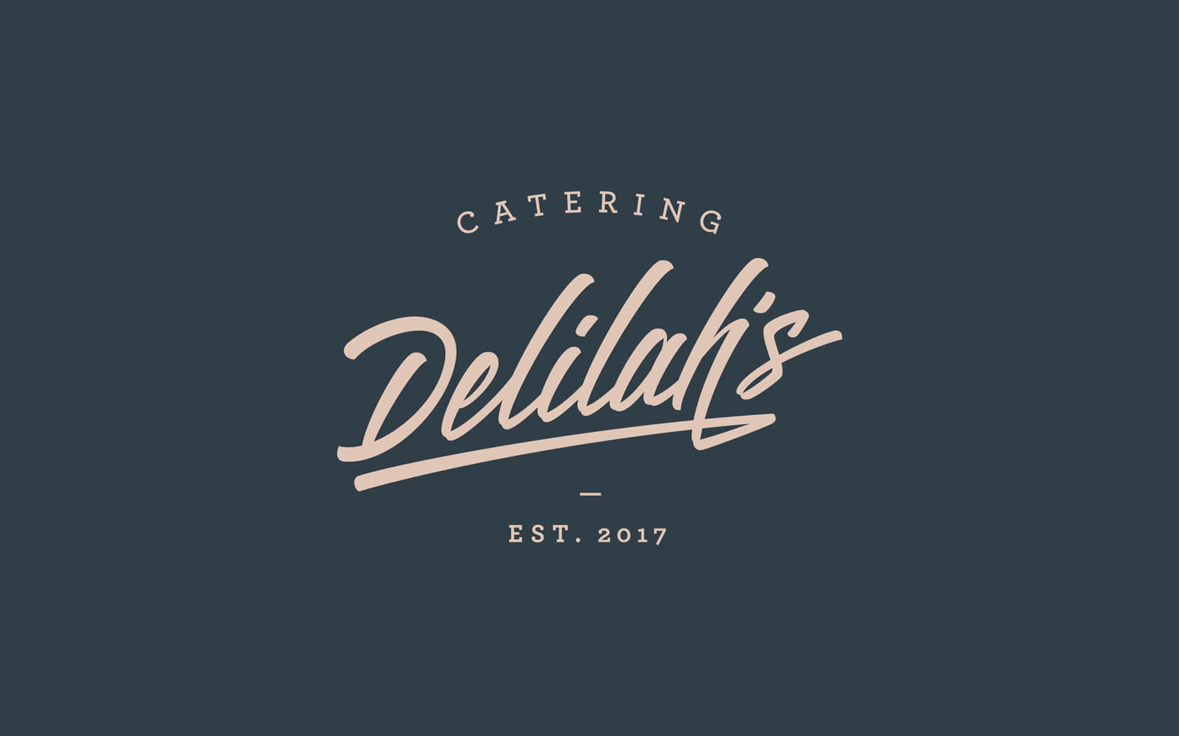
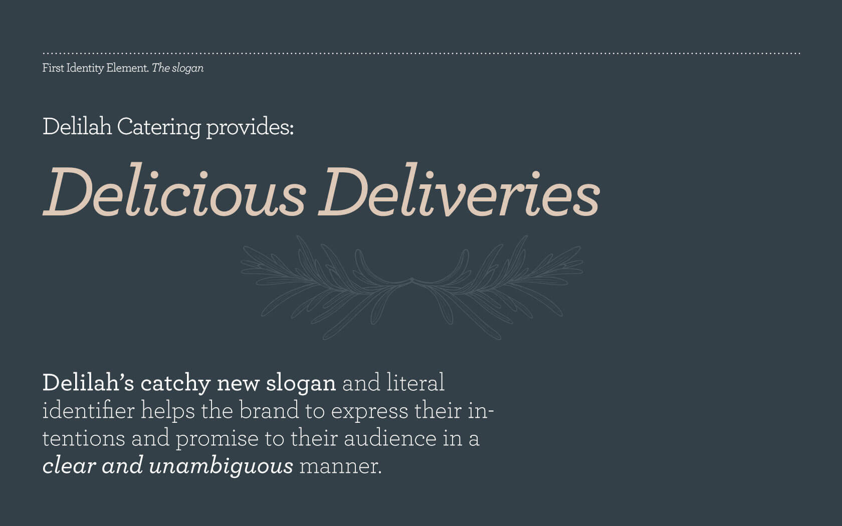
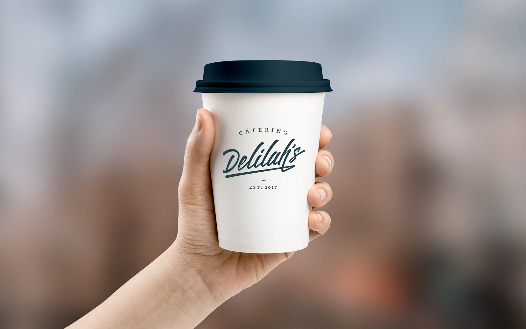
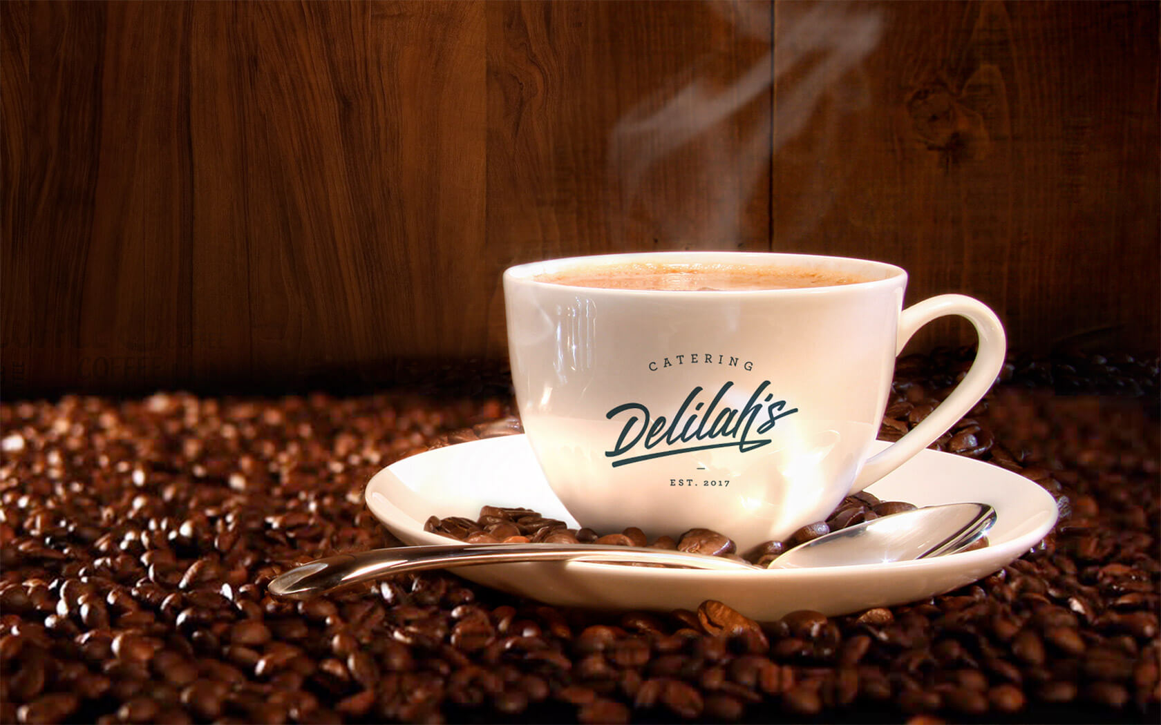
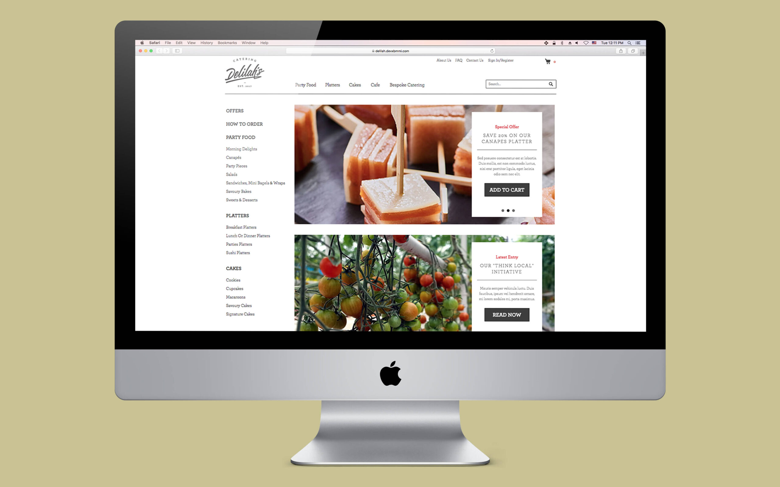
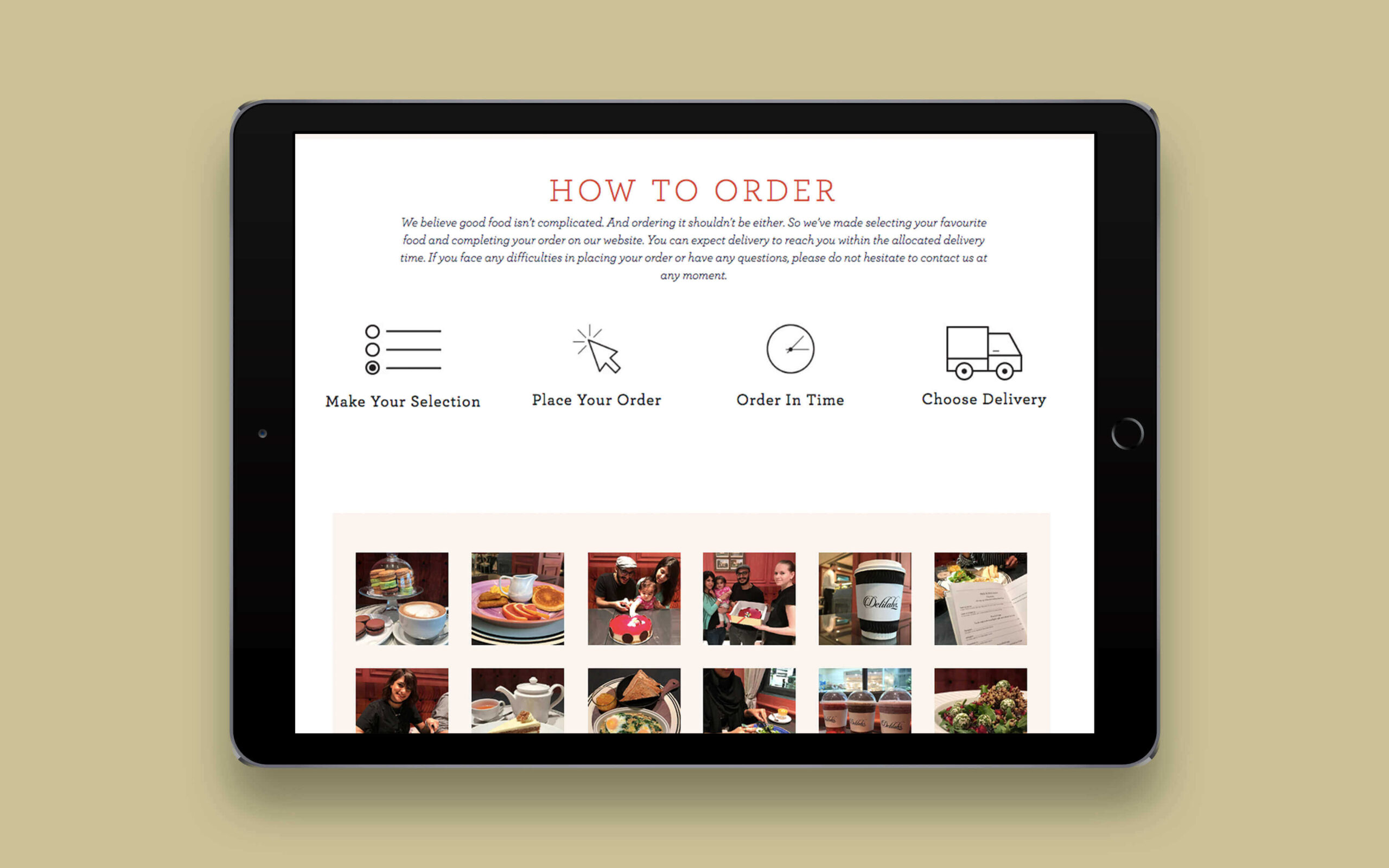
We understood the issues the owners of the cafe brand were experiencing and from our experience in helping other brands find their brilliance we knew we could help a cafe brand like Delilah’s to find its true calling. From our investigations with customers, we quickly understood what Delilah’s best products were and also what their biggest weakness was. This coupled with a clear strategic direction of expanding online and through catering, the cafe brand was given new legs and new revenue streams.
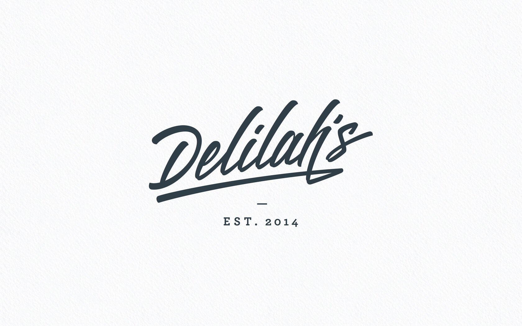
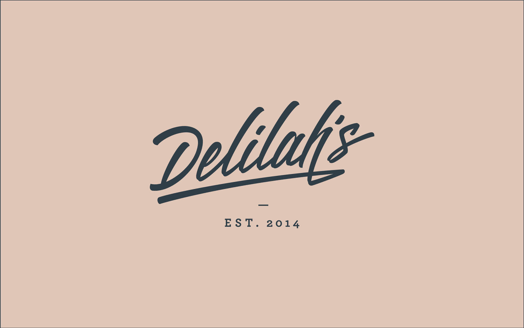
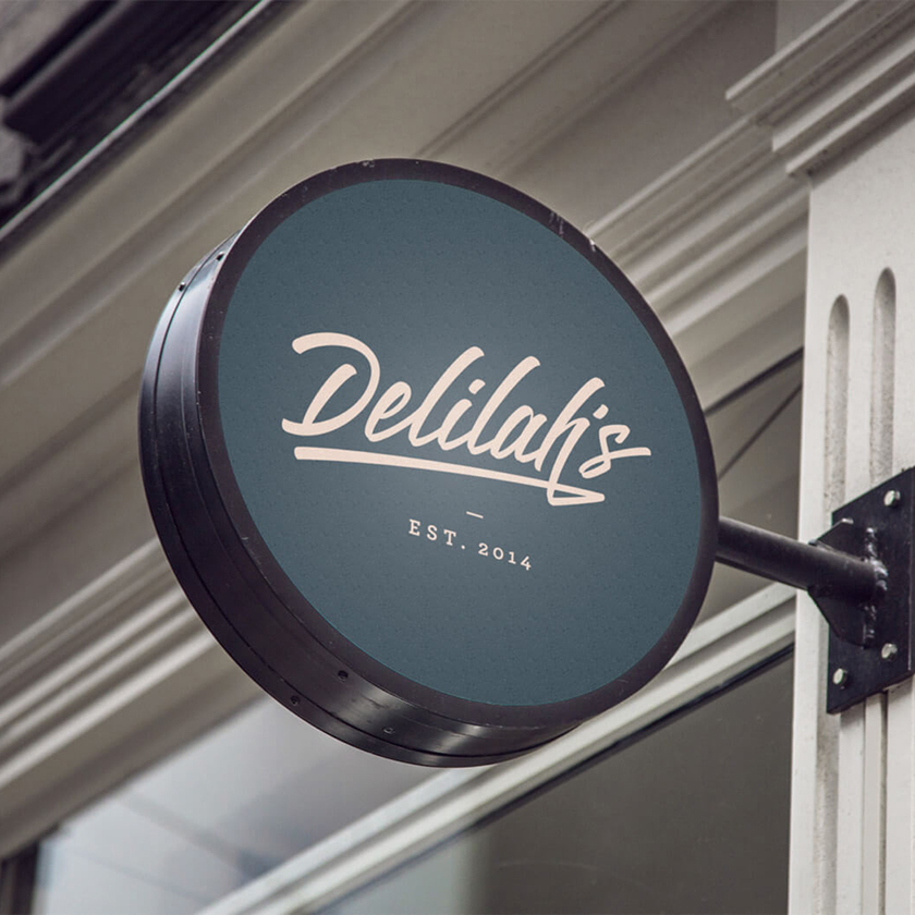
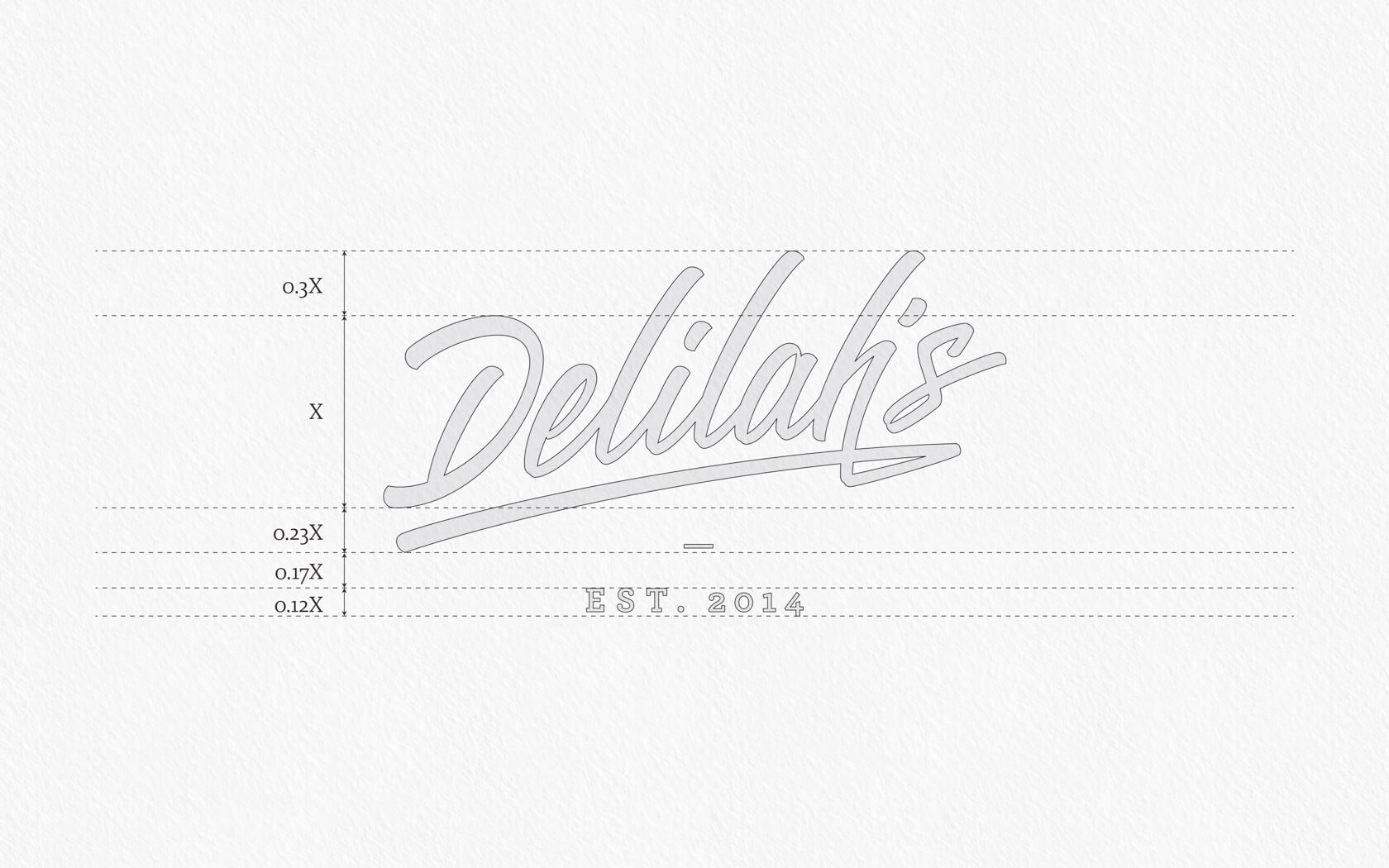
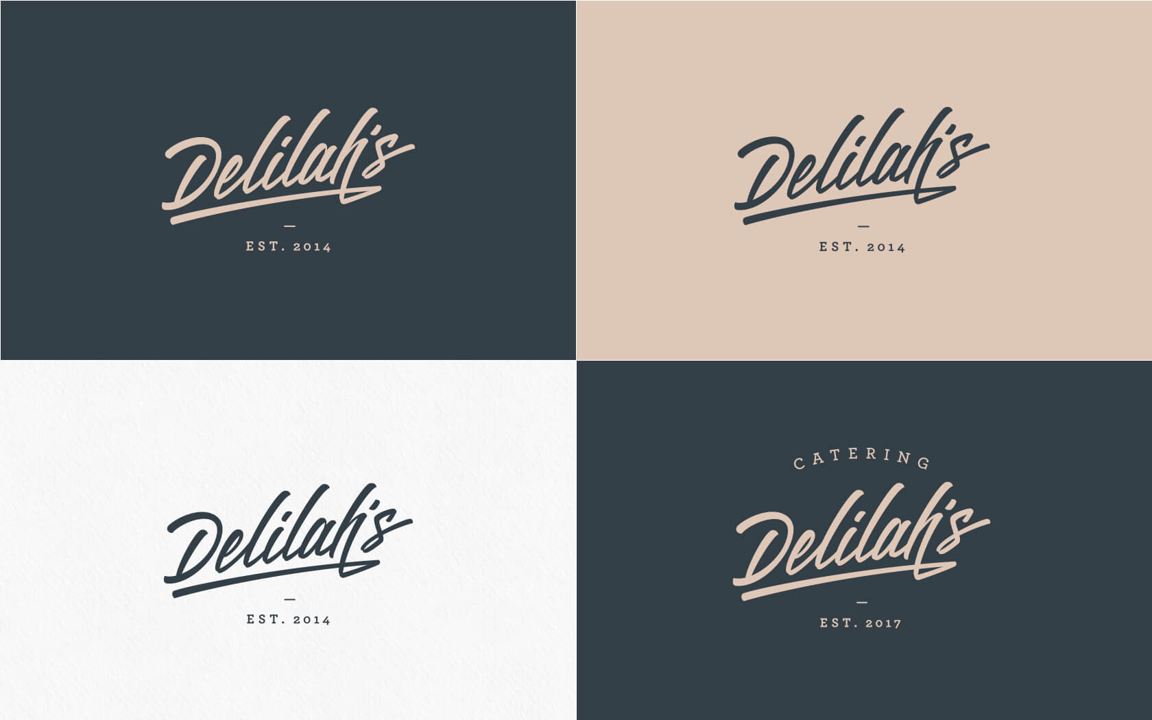
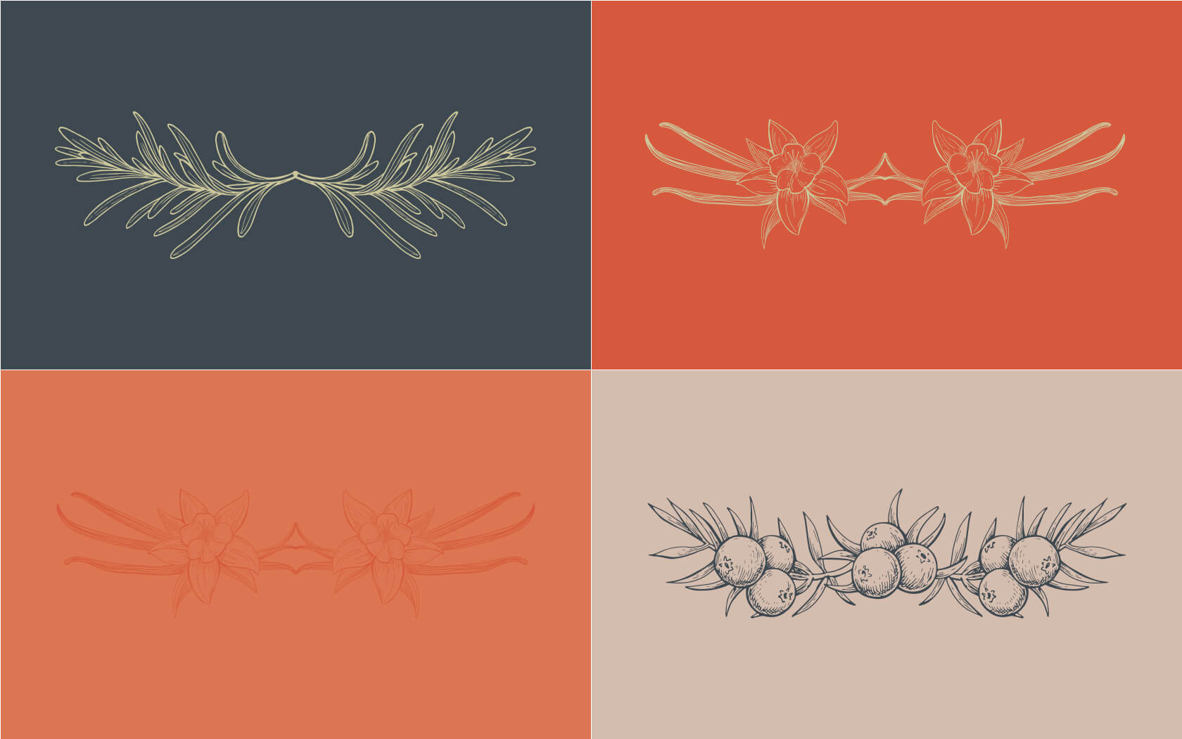
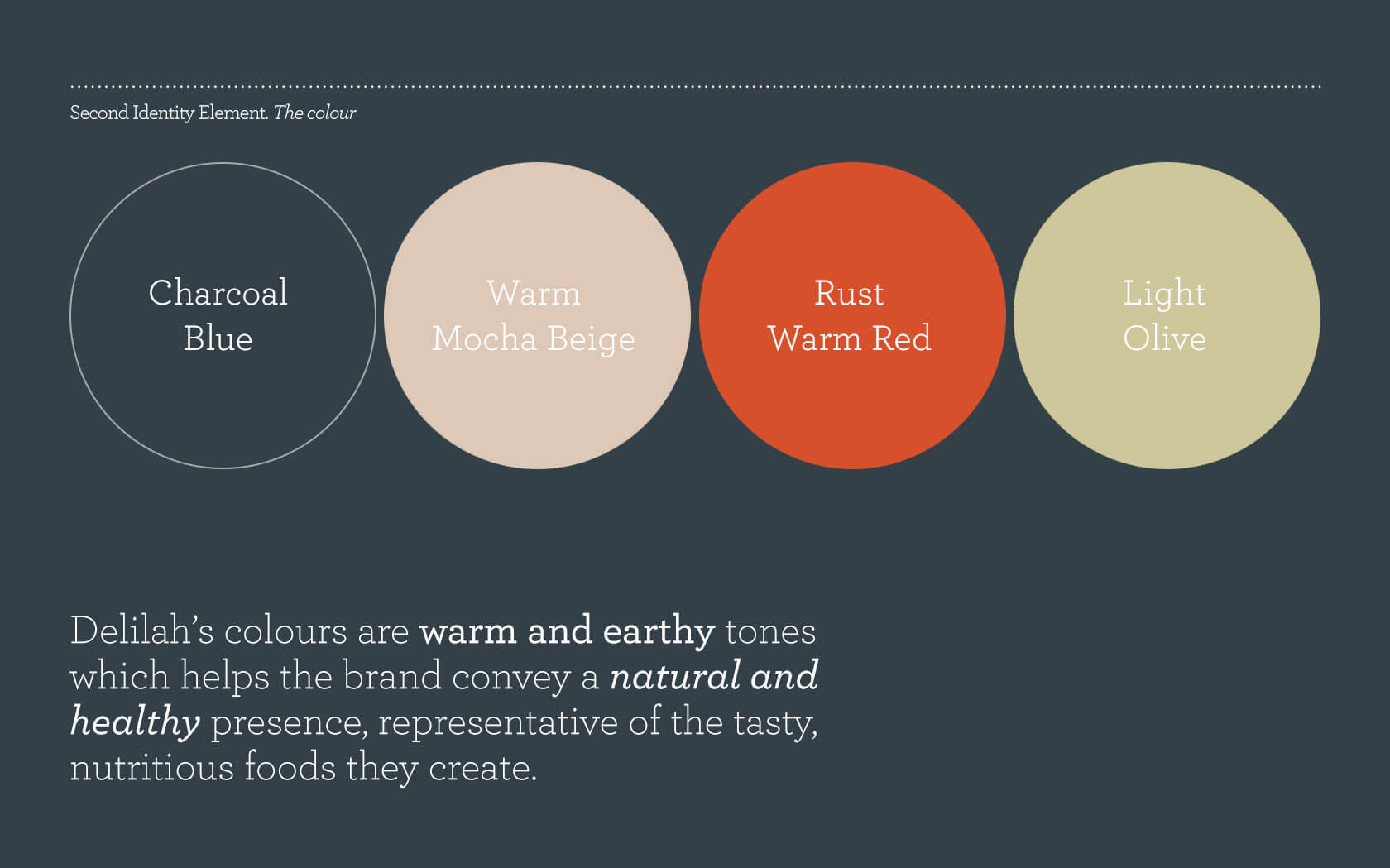
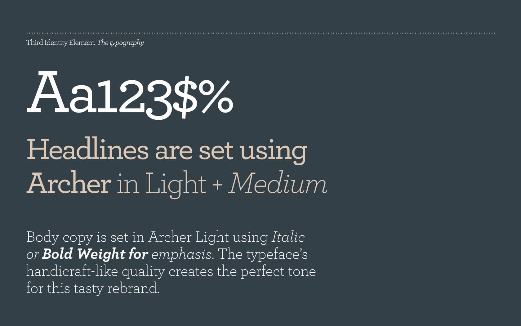
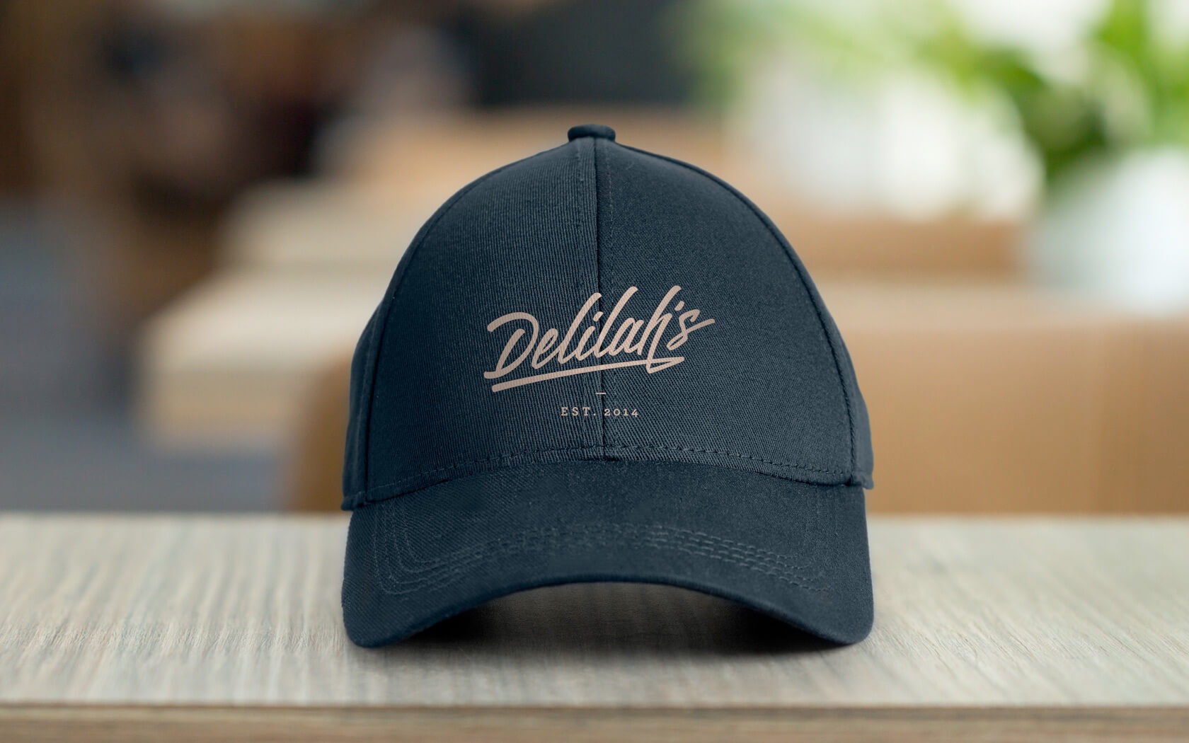
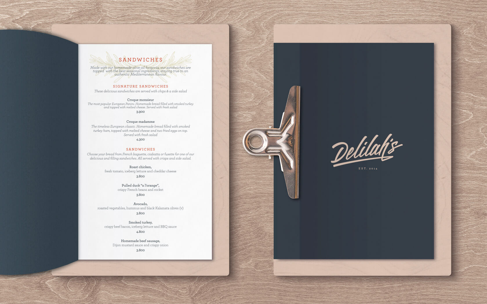
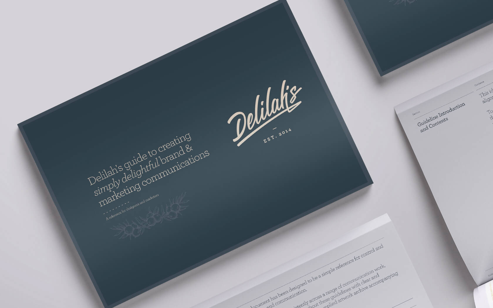
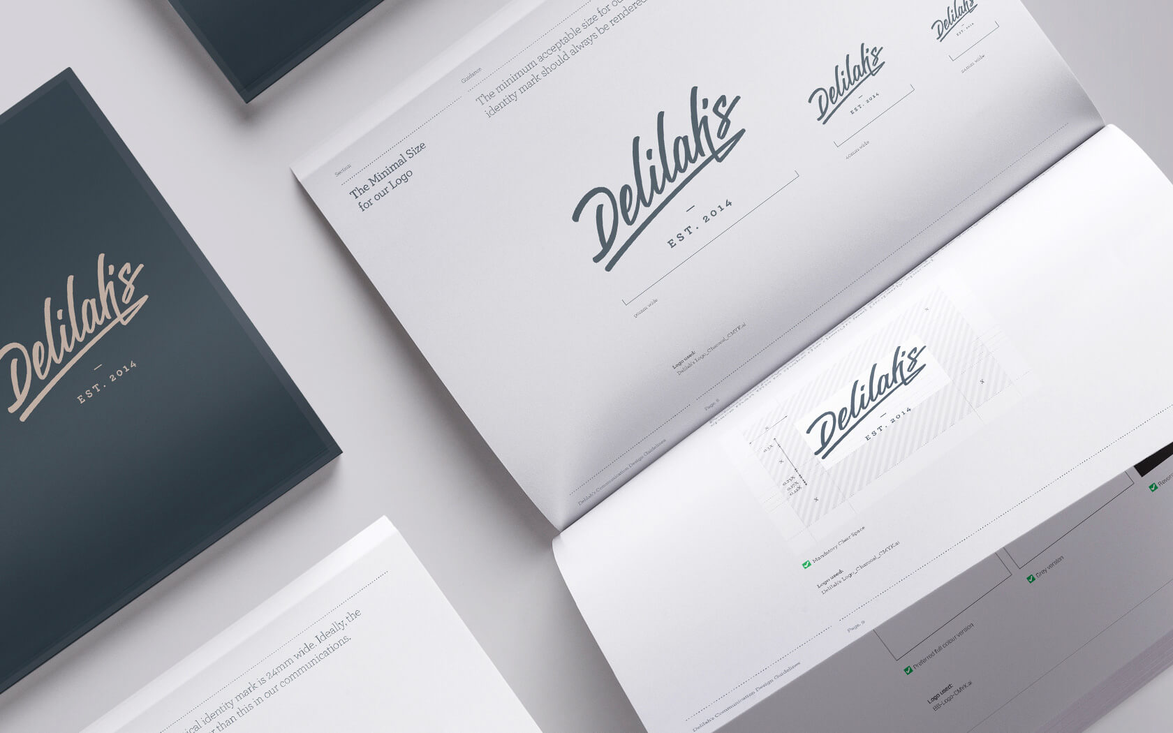
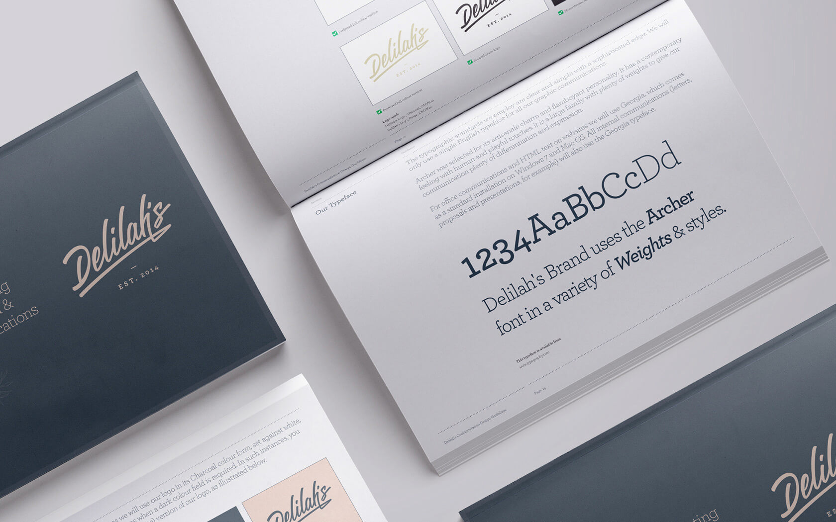
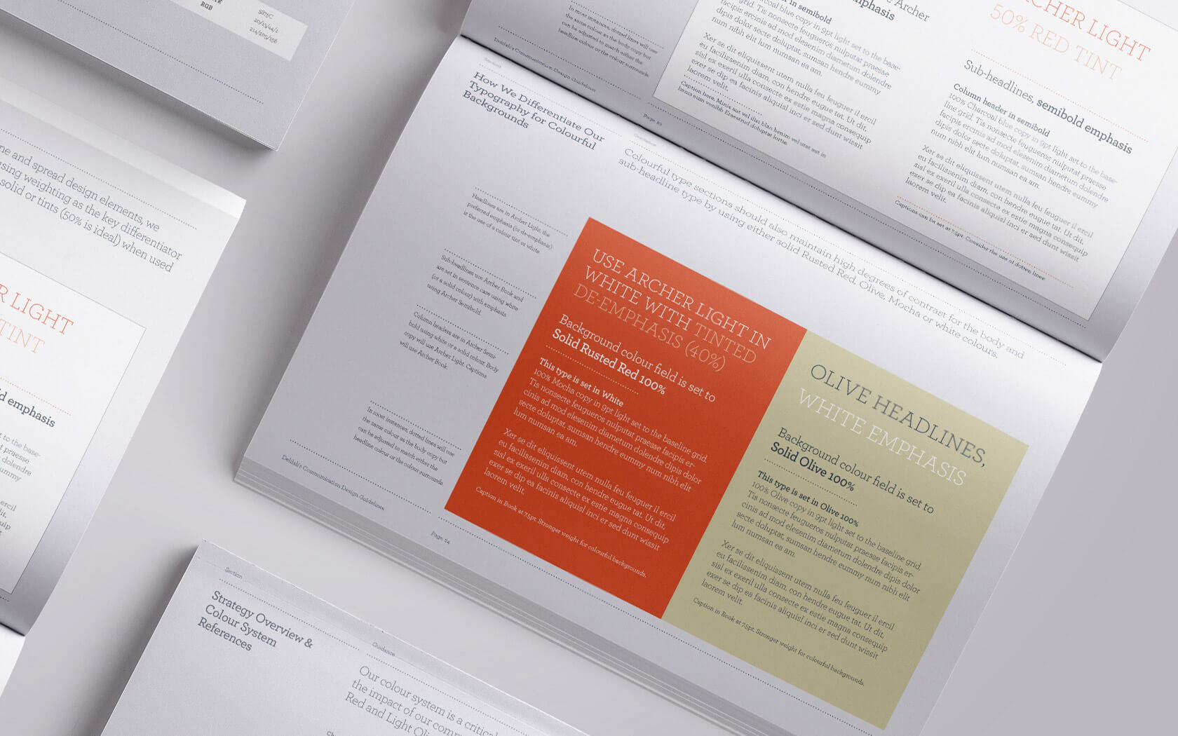
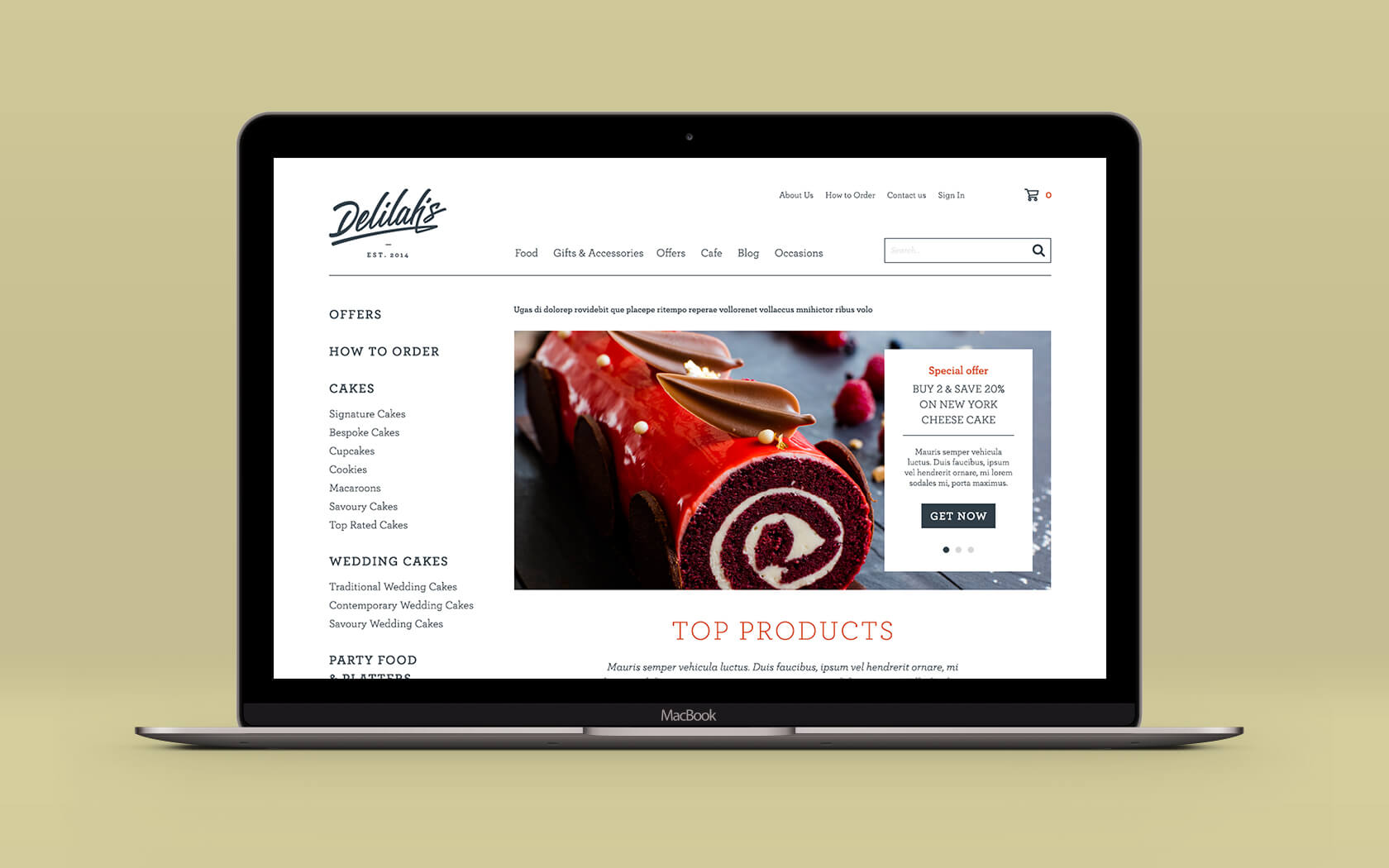
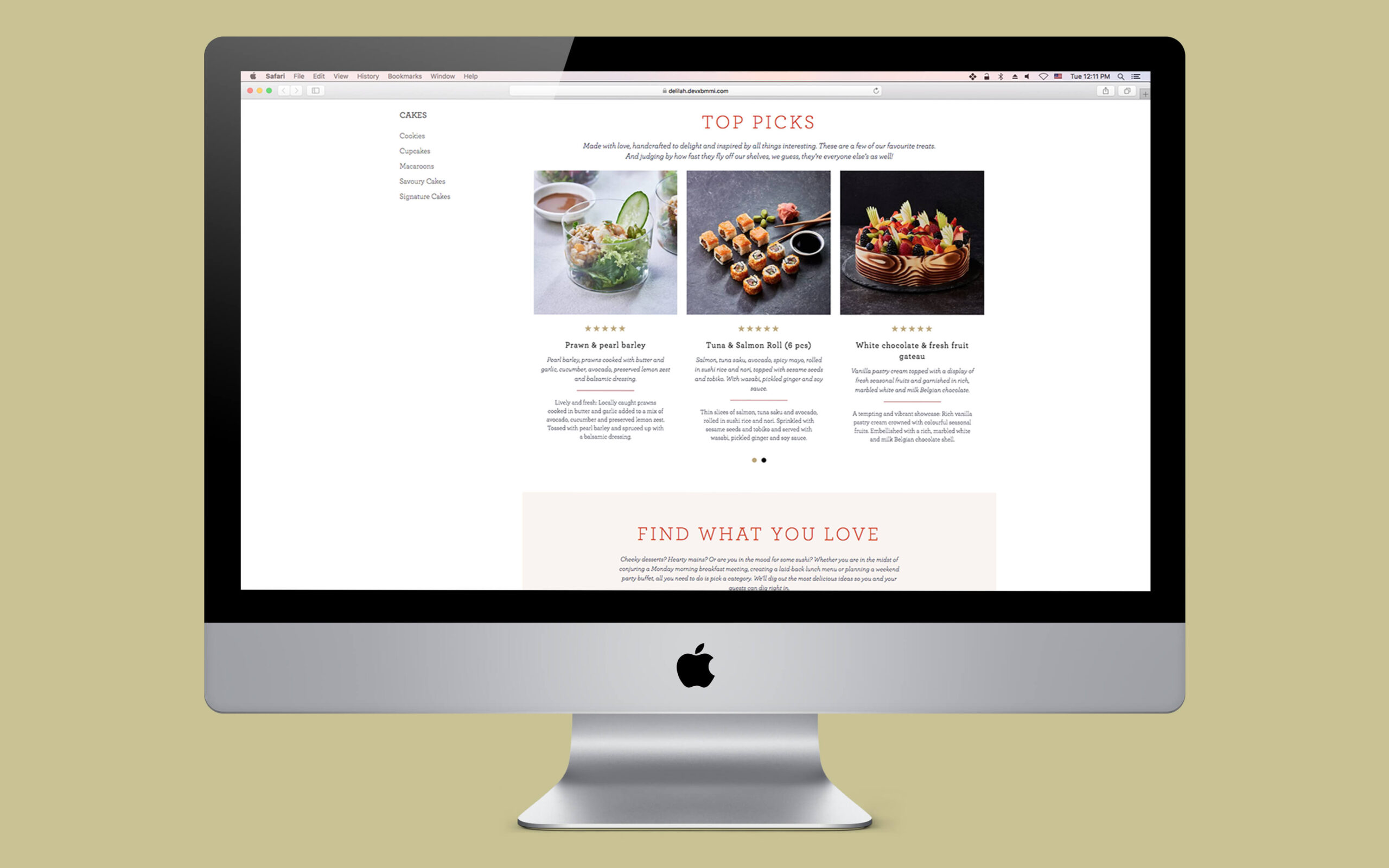
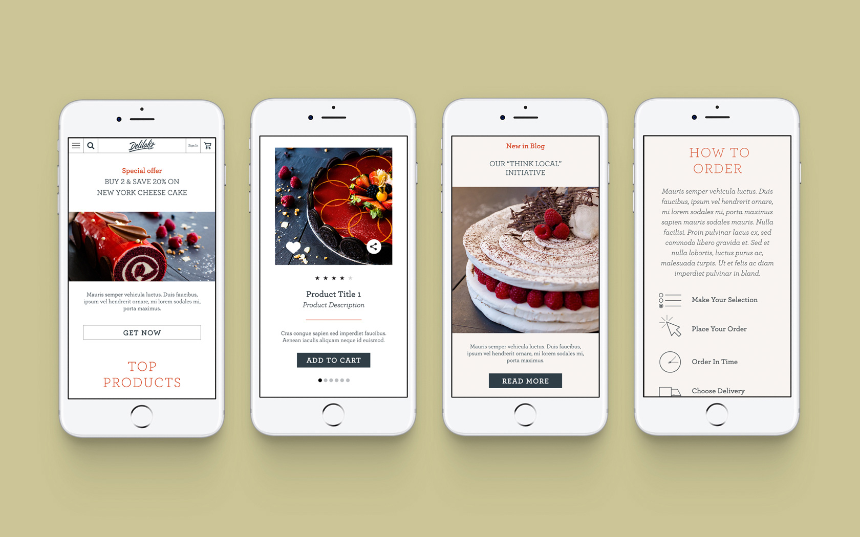
We helped Delilah’s to find and express its true self – the artisanal cafe brand experience that is best experienced through their best product – great cakes. Working with the client, we expressed the artisanal quality of the brand’s offer through a radically different brand mark. Gone was the classic font and in came a new signature mark. Added to this was a graphic palette rich in artisanal aesthetics, including a new brand font (Archer) and a new set of subtle, hand-drawn illustrations of spices and flavours.
Delilah’s successful new cafe brand identity
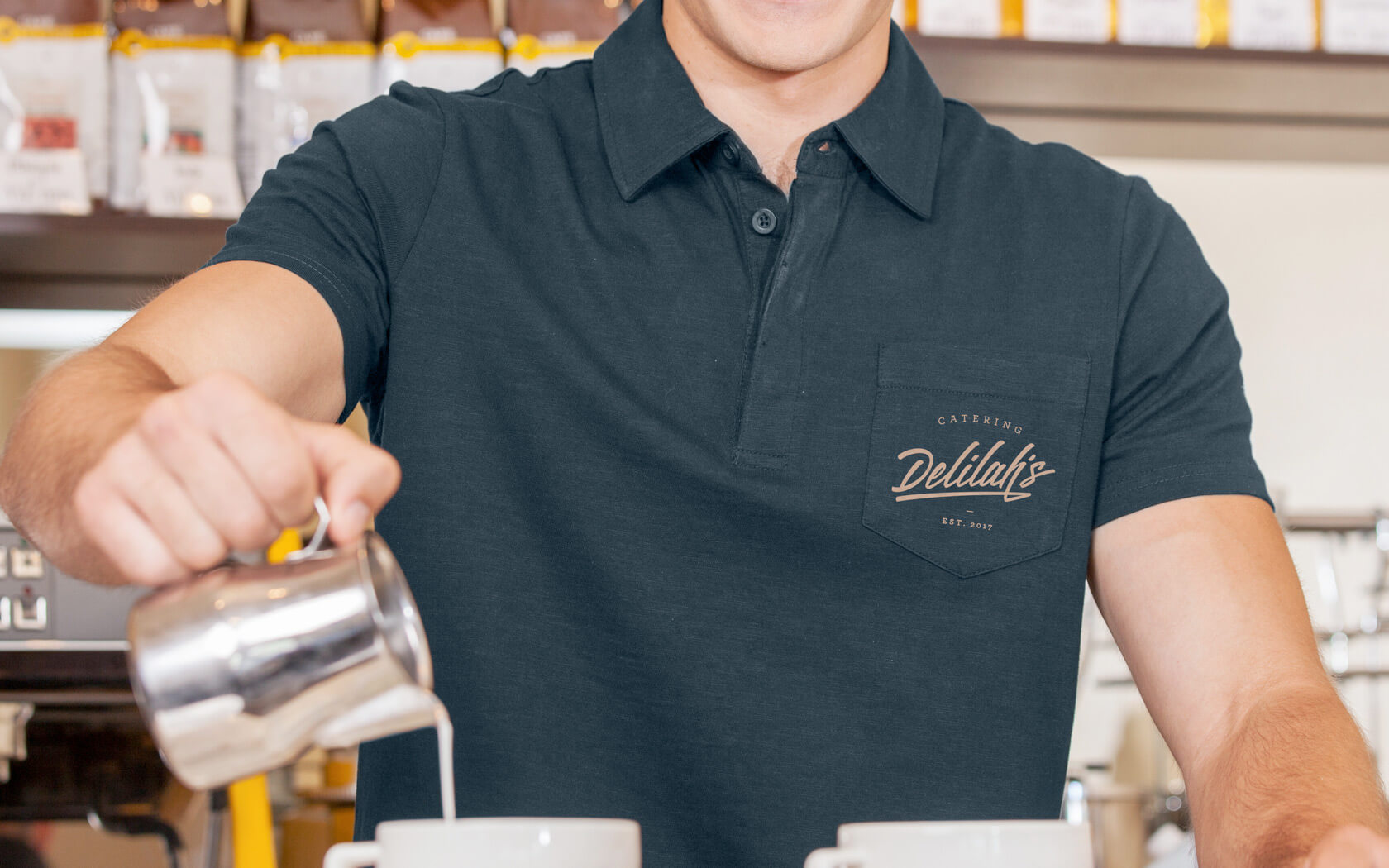
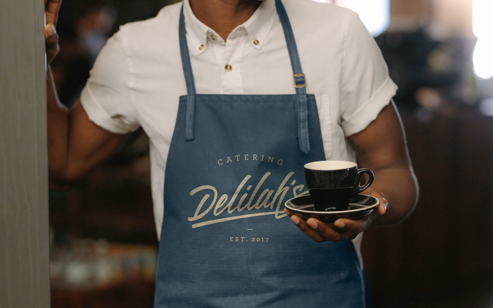
Delilah’s is presented now as an artisanal cafe brand with hand-crafted cakes as one of its signature lines. The brand is rolling out across all locations and the new online and offline catering offer is building new customers in new areas with new revenue streams flowing into the company.
The new aesthetic is a refreshing new look which now fully aligns the brand’s intention with its perception. The mark sets the tone of a hand-crafted experience while the combination of the Archer brand font and illustrations completes the personality expression of a brand that cares about well-crafted food.
Services Delivered
Brand Strategy, Naming, Brand Design, Visual Identity, Slogan, Tone of Voice, Digital Design, Print & Graphic Design.
Laughter is the brightest, where food is the best.
Irish proverb.
Details View Close
One clear takeaway from this project is the edibility of the end result – nomnom!
Liam Farrell. Creative Director & Partner.
Infracorp.
Website
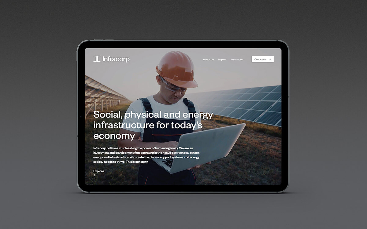
Two times Transform Award winners, Infracorp's unique digital home is effortless online design at its best.
GFH
Annual & ESG Report
Slick print treatments from slip case to back cover and every section in between for this impressive annual and ESG report for one of the GCC's leading financial groups.
Rukn.
Rebrand

At last, Bahrain’s tech-entrepreneurs have their own incubator to help them grow IT from ideas into gazelles!
XLR8.
Branding

An exhilarating new sports brand for one of Bahrain's most dynamic business groups; GFH's new XLR8 takes to the streets.
Khaleeji
Brand Book
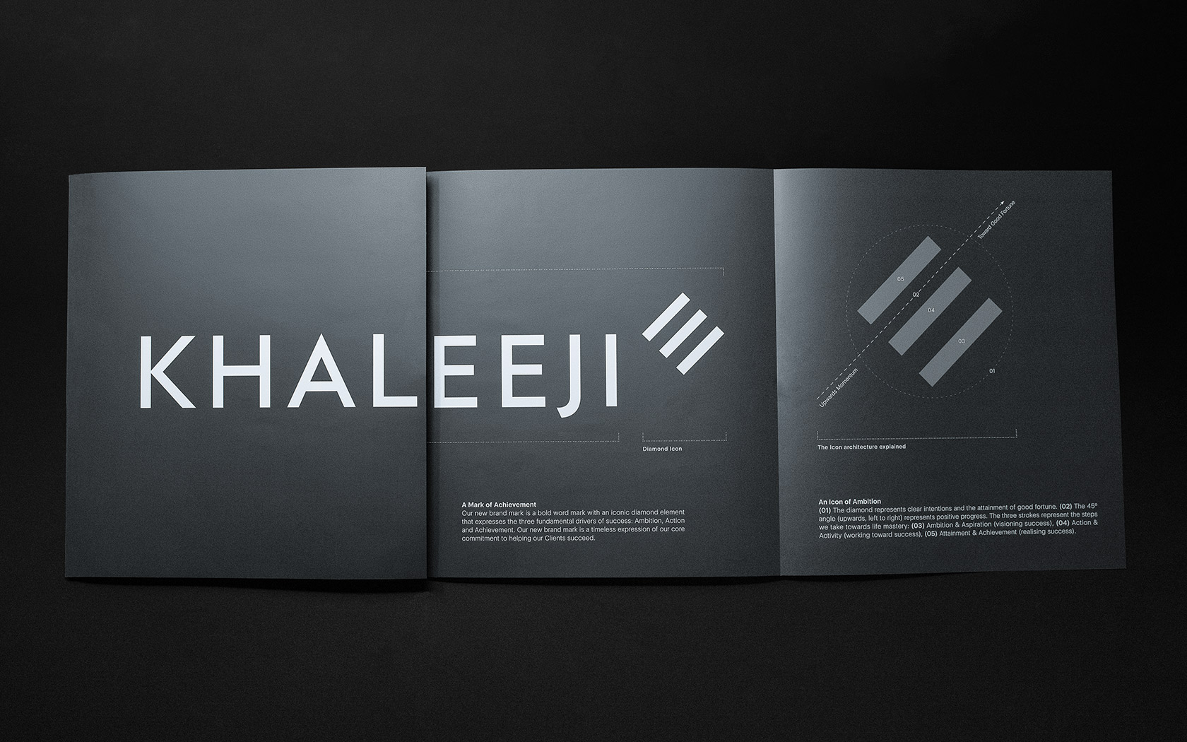
Helping cement understanding of its ambitious new brand is this rather fancy launch book for Khaleeji. Prestige papers and refined print treatments provide a touch of class from cover to cover.